Building a Component Library in Rails With Storybook
In recent years, the Rails ecosystem improved by leaps and bounds and is catching up with the evolutions that developers use and love in JavaScript frameworks.
Under the code name NEW MAGIC (now known as Hotwire), the Basecamp team released Turbo and Stimulus in 2020, adding powerful capabilities such as near-instant navigation, first-party WebSocket support, lazy-loading parts of your application, and many others.
However, the Rails development I’m most excited about is the ability to build your own component library, powered by View Component and Storybook.
A component library is a set of components (buttons, alerts, domain-specific widgets, etc.) that can be reused throughout the app, reducing the need for duplication and improving the consistency of our UX and codebase.
This article will explain how to create your own component library of View Components and deploy it with Storybook, enabling all your team members to try, tweak and audit them in isolation.
A Primer on View Components and Storybook
Last fall, I stumbled upon a great RailsConf talk called Encapsulating Views by Joel Hawksley, introducing the View Components gem—GitHub’s take on making React-like components in Rails a reality.
View Components make it easy to build reusable, testable & encapsulated components in your Ruby on Rails app. We will not dive deeply into View Components in this post, but if you’re not familiar with them, I highly recommend taking a look at the first few paragraphs of the docs before continuing—they do a great job at explaining their benefits and use cases.
At Orbit, we are slowly building a list of View Components that we reuse across the app—buttons, selects, dropdowns,… However, as the list grows, it’s becoming harder for the whole team (engineering, design, and product) to know what is already available and reusable. We needed a way to organize this library.
A common (and honestly amazing) tool for such component libraries in JS-based apps is called Storybook. Storybook is an interface that provides an interactive playground for each component, alongside its documentation and other niceties. Here are some examples of Storybooks:
- Here’s the one from The Guardian
- The one from GitLab
- From Shopify
- And our very own at Orbit!
Storybook used to be only compatible with Single Page Apps created with JavaScript frameworks: React, Vue, Angular, and many others. Fortunately for us, the recent V6 release of Storybook introduced the @storybook/server package, which allows for any HTML snippet to be used as a component in Storybook. Theoretically, this allows for a Rails backend to render the components for Storybook. But how does that work in practice?
For the purpose of this article, we’re going to work off of a fresh Rails project and work our way through installing the required gems, create our first ViewComponent, display it in Storybook, and deploy it alongside our app. The source code for this Rails project is available on GitHub: https://github.com/phacks/rails-view-components-storybook.
If you’d rather jump into a particular section (as you might already be familiar with some of the concepts we’ll cover), here’s the outline for the rest of the article:
- Setting up a fresh Rails install
- Creating our first View Component
- Setting up component previews
- Setting up Storybook with the ViewComponent::Storybook gem
- Writing a story for our ButtonComponent
- Deploying our Storybook alongside our app
- Conclusion
Setting Up a Fresh Rails Install
Let’s create a new Rails project by following the steps listed in Section 3.1 in the Rails Getting Started guide, then run
rails new rails-view-components-storybook
cd rails-view-components-storybook
rails webpacker:install

# in one terminal window
bin/webpack-dev-server

# in another terminal window
rails server
That should get a Rails project up and running at http://localhost:3000
We’re going to add a static page to our Rails app which will serve as a kitchen sink to view and interact with our upcoming View Components. To do so, we can create or update the following files:
app/controllers/pages_controller.rb
class PagesController < ApplicationController
  def show
    render template: "pages/#{params[:page]}"
  end
end
config/routes.rb
Rails.application.routes.draw do
  get "/pages/:page" => "pages#show"
end
app/views/pages/kitchen-sink.html.erb
<article class="prose m-24">
  <h1>ViewComponents kitchen sink</h1>
  <p>This page will demo our ViewComponents</p>
</article>
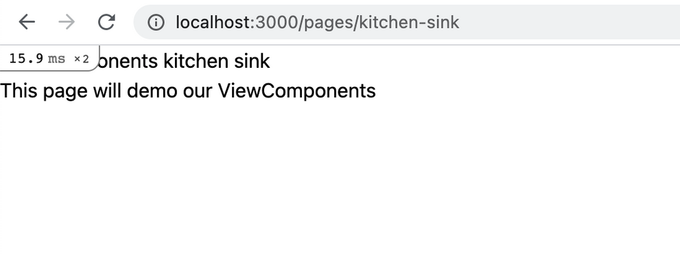
We should now see that new page over at http://localhost:3000/pages/kitchen-sink. Great!

In order to add styles to our upcoming components, we’re going to add TailwindCSS (a utility-first CSS framework). Please note that it is not a requirement for either Storybook or ViewComponents—we only install it here for conciseness and convenience in styling our component. You do not need to have any prior knowledge of Tailwind to continue reading this article.
Replace the contents of app/views/layouts/application.html.erb with:
<!DOCTYPE html>
<html>
  <head>
    <title>RailsViewComponentsStorybook</title>
    <meta name="viewport" content="width=device-width,initial-scale=1">
    <%= csrf_meta_tags %>
    <%= csp_meta_tag %>

    <%= stylesheet_link_tag 'application', media: 'all', 'data-turbolinks-track': 'reload' %>
    <%= javascript_pack_tag 'application', 'data-turbolinks-track': 'reload' %>
    <link rel="stylesheet" href="https://unpkg.com/tailwindcss@^2/dist/base.min.css" />
    <link rel="stylesheet" href="https://unpkg.com/tailwindcss@^2/dist/components.min.css" />
    <link
      rel="stylesheet"
      href="https://unpkg.com/@tailwindcss/typography@0.2.x/dist/typography.min.css"
    />
    <link rel="stylesheet" href="https://unpkg.com/tailwindcss@^2/dist/utilities.min.css" />
  </head>

  <body>
    <%= yield %>
  </body>
</html>
Note: although using unpkg is the simplest way to install TailwindCSS, it is not recommended to do so for production applications as it will cause performance issues. Should you want to install TailwindCSS for a production application, I’d recommend following their instructions.
Creating Our First View Component
Buttons are one of the most commonly used UI components throughout web applications, and are usually one of the first that comes to mind when the time comes to create a component library. Let’s build a Button ViewComponent!
In the Gemfile, add
gem "view_component", require: "view_component/engine"
Then run bundle install and restart the Rails server to finish installing the ViewComponents gem.
We want our button to have different styles depending on how we’re planning to use it: primary, outline and danger. Let’s create a new ViewComponent called Button with a type property:
# in another terminal window
bin/rails generate component Button type --preview
This command generates four files:
app/components/button_component.rb: the ViewComponent itself;app/components/button_component.html.erb: its template;test/components/button_component_test.rb: its test suite;test/components/previews/button_component_preview.rb: its preview.
We’re not going to cover ViewComponents testing in this post; if you’re curious, the relevant docs page is a great resource to get started.
Let’s define our component template so that it outputs a styled <button> rendering the content passed into the ViewComponent:
app/components/button_component.html.erb
<button class="<%= classes %>">
  <%= content %>
</button>
Then, we can add the logic to apply different classes for the different types:
app/components/button_component.rb
# frozen_string_literal: true

class ButtonComponent < ViewComponent::Base
  attr_accessor :type

  PRIMARY_CLASSES = %w[
    disabled:bg-purple-300
    focus:bg-purple-600
    hover:bg-purple-600
    bg-purple-500
    text-white
  ].freeze
  OUTLINE_CLASSES = %w[
    hover:bg-gray-200
    focus:bg-gray-200
    disabled:bg-gray-100
    bg-white
    border
    border-purple-600
    text-purple-600
  ].freeze
  DANGER_CLASSES = %w[
    hover:bg-red-600
    focus:bg-red-600
    disabled:bg-red-300
    bg-red-500
    text-white
  ].freeze
  BASE_CLASSES = %w[
    cursor-pointer
    rounded
    transition
    duration-200
    text-center
    p-4
    whitespace-nowrap
    font-bold
  ].freeze

  BUTTON_TYPE_MAPPINGS = {
    primary: PRIMARY_CLASSES,
    danger: DANGER_CLASSES,
    outline: OUTLINE_CLASSES
  }.freeze

  def initialize(type: :primary)
    @type = type
  end

  def classes
    (BUTTON_TYPE_MAPPINGS[@type] + BASE_CLASSES).join(' ')
  end

end
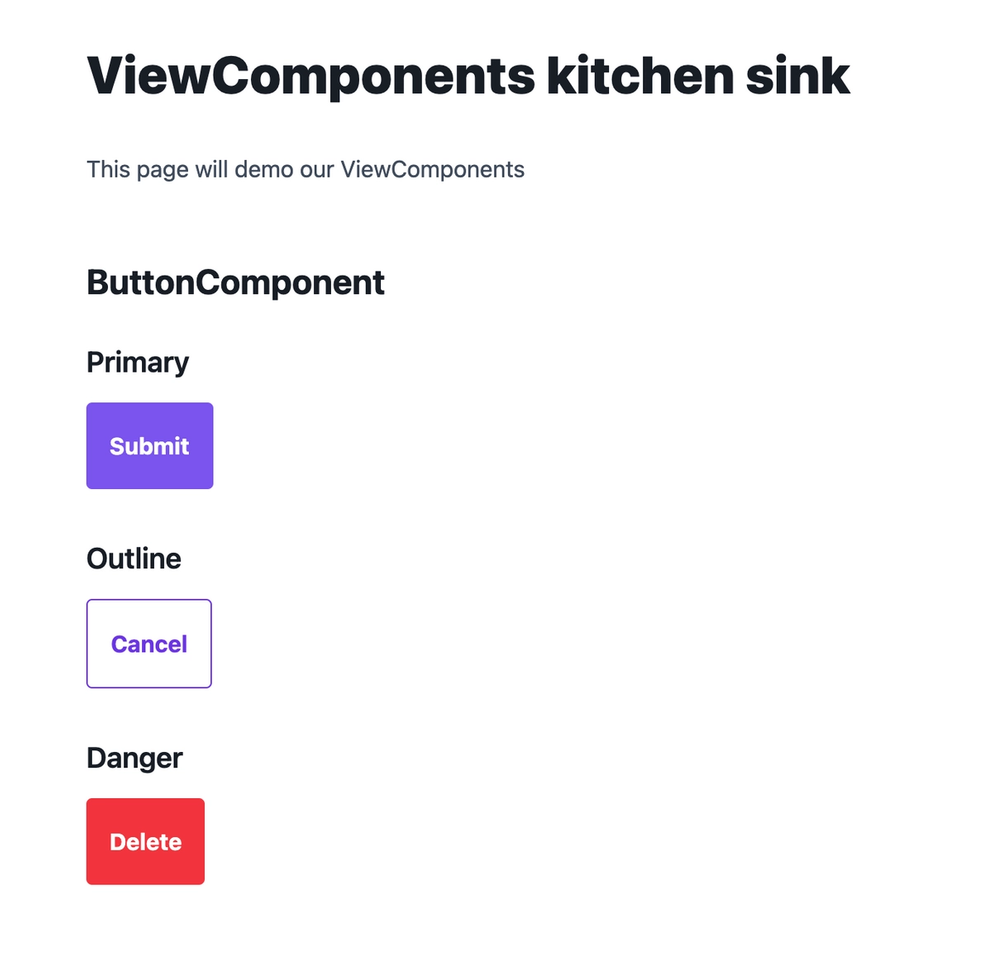
And finally we can instantiate all three types of buttons in our kitchen sink page:
app/views/pages/kitchen-sink.html.erb
<article class="prose m-24">
  <h1>ViewComponents kitchen sink</h1>
  <p>This page will demo our ViewComponents</p>

  <h2>ButtonComponent</h2>
  <h3>Primary</h3>
  <%= render(ButtonComponent.new(type: :primary)) do %>
    Submit
  <% end %>

  <h3>Outline</h3>
  <%= render(ButtonComponent.new(type: :outline)) do %>
    Cancel
  <% end %>

  <h3>Danger</h3>
  <%= render(ButtonComponent.new(type: :danger)) do %>
    Delete
  <% end %>
</article>
We have our ButtonComponent all ready for others to use!

Setting Up Component Previews
ViewComponents come ready with a handy feature: component previews. They allow us to get a URL in which to view and interact with our ViewComponent in isolation.
We can see the preview for our ButtonComponent at the following URL: http://localhost:3000/rails/view_components/button_component/default
The default preview instantiates the ButtonComponent without any parameters, which explains why we see the :primary button type and no content. We can update the preview file to teach it about the different variants:
test/components/previews/button_component_preview.rb
class ButtonComponentPreview < ViewComponent::Preview
  def default(type: :primary)
    type = type.to_sym if type

    render(ButtonComponent.new(type: type)) { 'Button' }
  end
end
We can then control our component through the type and content query params. For example, http://localhost:3000/rails/view_components/button_component/default?type=danger will render a red button, and http://localhost:3000/rails/view_components/button_component/default?type=outline will render an outlined one.
Let’s also add individual stories for each button state. That makes it easy to reason about as the component grows in supported states because it reduces ambiguity about which props are intended to be used together:
test/components/previews/button_component_preview.rb
class ButtonComponentPreview < ViewComponent::Preview
  def default(type: :primary)
    type = type.to_sym if type

    render(ButtonComponent.new(type: type)) { 'Button' }
  end

  def primary
    render(ButtonComponent.new(type: :primary)) { 'Submit' }
  end

  def outline
    render(ButtonComponent.new(type: :outline)) { 'Cancel' }
  end

  def danger
    render(ButtonComponent.new(type: :danger)) { 'Delete' }
  end
end
We can check that these previews work as intended by visiting the following URLs:
- http://localhost:3000/rails/view_components/button_component/primary
- http://localhost:3000/rails/view_components/button_component/outline
- http://localhost:3000/rails/view_components/button_component/danger
This mechanism will be leveraged in the next section to control our ViewComponent through Storybook controls. It’s time to add Storybook to our project!
Setting Up Storybook With the ViewComponent::Storybook Gem
The view_component_storybook gem is the bridge between Ruby on Rails land and Storybook. It gives us a Ruby DSL in which we can write stories (Storybook’s main concept: think a specific state of a UI component), that will then be translated in Storybook parlance. It also takes care of gluing together the ViewComponents previews and Storybook’s API.
Important note: the instructions below differ from the view_component_storybook official docs. This version allows for easier deployment of the Storybook to a public URL, which will be discussed in Deploying our Storybook alongside our app. If you don’t plan on deploying your Storybook, you might want to follow the official docs instead.
First, in our console, we can install the following Storybook packages. This is required to get the Storybook interface up and running:
yarn add @storybook/server @storybook/addon-controls --dev
Then, let’s add the view_component_storybook gem to your Gemfile and declare it in our application:
Gemfile
gem "view_component_storybook"
config/application.rb
require_relative "boot"

require "rails/all"

# Require the gems listed in Gemfile, including any gems
# you've limited to :test, :development, or :production.
Bundler.require(*Rails.groups)

module RailsViewComponentsStorybook
  class Application < Rails::Application
    # Initialize configuration defaults for originally generated Rails version.
    config.load_defaults 6.1

    # Configuration for the application, engines, and railties goes here.
    #
    # These settings can be overridden in specific environments using the files
    # in config/environments, which are processed later.
    #
    # config.time_zone = "Central Time (US & Canada)"
    # config.eager_load_paths << Rails.root.join("extras")

    require "view_component/storybook/engine"

    # Enable ViewComponents previews
    config.view_component.show_previews = true
  end
end
We can then create the Storybook configuration files in a new .storybook folder located at the root of the project:
.storybook/main.js
module.exports = {
  stories: ["../test/components/**/*.stories.json"],
  addons: ["@storybook/addon-controls"],
};
.storybook/preview.js
export const parameters = {
  server: {
    url: `${location.protocol}${location.hostname}${
      location.port !== "" ? ":3000" : ""
    }/rails/view_components`,
  },
};
We’ll wrap up the setup by adding shortcuts in package.json to build the Storybook files:
package.json
 {
  "name": "rails-view-components-storybook",
  // ...
  "scripts": {
    "storybook:build": "build-storybook -o public/_storybook"
  }
}
We can then restart the Rails server to account for the new gem.
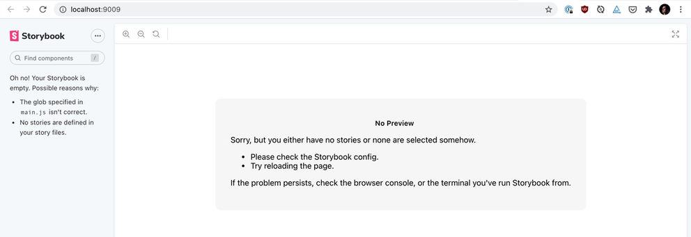
Phew! That was quite a lot of configuration—fortunately, we only have to set everything up this one time. We should now be all up and running. Let’s check that Storybook is properly set up by running yarn storybook:build and visiting http://localhost:3000/_storybook/index.html

While we have Storybook up and running, you might notice that our ButtonComponent is nowhere to be found. That’s totally normal: we need to write a story for it first.
Writing a Story for Our Button Component
In Storybook, a story represents the state of a UI component. A component can have one or many stories, usually depending on its complexity: one can imagine a Select component with a few options, or a lot, or not at all. In our case, we’ll create a story for each state of our Button component (:primary, :outline and :danger) and another, default one that will allow us to control the type interactively.
A story can also define one or more controls: those will define the interactive bits of our components. In our default story, we can define a control for the button type. That control will be a select as we want the Storybook visitor to be able to select the type between the three available options. There are a lot more controls available in the view_component_storybook gem, and the full list is available here.
Let’s create a story for our component using the Story DSL of view_component_storybook:
test/components/stories/button_component_stories.rb
class ButtonComponentStories < ViewComponent::Storybook::Stories
  story(:default) do
    controls do
      select(:type, %w[primary outline danger], 'primary')
    end
  end

  story(:primary) {}
  story(:outline) {}
  story(:danger) {}
end
We can now ask view_component_storybook to convert that Ruby story to a JSON one, which will then automatically get picked up by Storybook:
rake view_component_storybook:write_stories_json
This generates a new button_component.stories.json file alongside the Ruby story that is compatible with Storybook’s API.
Let’s re-build our Storybook instance to see that story in action:
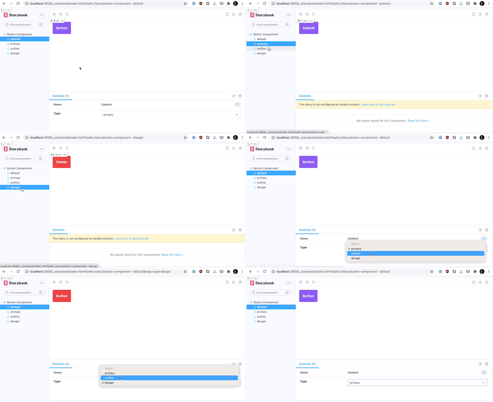
Now, http://localhost:3000/_storybook/index.html should display our Button in the different state, and the associated controls to interactively change its type for the default story.

Congratulations—we have created our first component in our Rails component library!
Deploying Storybook Alongside Our app
A component library works best when the whole team—engineers, designers, product folks—can see which components are available, know which variants and customization options are available, and get a sense of how they can be used by using them directly. A publicly accessible URL is a great way to achieve this, as one can then include a link to a particular component variant when discussing an upcoming feature.
At its core, Storybook is a React app—which means that deployment is a matter of hosting a static website. We aimed for a simple setup for our Storybook, and found one right under our nose: Rails is very capable of hosting static webpages itself!
As you might have noticed, you had to run yarn storybook:build for our story to appear in Storybook. We defined that command in package.json as followed:
"storybook:build": "build-storybook -o public/_storybook"
What this command does under the hood is compile all the files from Storybook and storing them under the public/_storybook directory of our Rails application. Because files under public are accessible publicly in Rails, this results in the Storybook being accessible at the URL <YOUR_APP_ROOT_URL>/_storybook/index.html. That’s the reason why we were able to see our local Storybook instance at http://localhost:3000/_storybook/index.html!
The main advantage of that solution is that deploying Storybook is now completely transparent and integrated into your Rails deployment pipeline. When adding a new component, updating a story, or installing a Storybook Addon, we only need to run yarn storybook:build and commit the resulting files for those updates to be deployed alongside the rest of our Rails app.
To illustrate that point, let’s take the example of the Rails app we’ve been using for this article. You can visit the Rails app itself at https://rails-view-components-storyboo.herokuapp.com/pages/kitchen-sink, and the Storybook we just built at https://rails-view-components-storyboo.herokuapp.com/_storybook/index.html. Ain’t that cool?
Conclusion
In this article, we saw how we can leverage the view_component and view_component_storybook gems to build a Storybook component library in a Rails app.
The setup described here is admittedly simple, but our team at Orbit is happily using and refining it, and it helps us iterate faster on UI components. We also rely on Storybook Addons for automatic accessibility audits, components documentation, inline Figma designs, and more. If you’re curious about our setup or would like to discuss this article, feel free to reach out on Twitter—I’d be happy to chat! And if you enjoy
The intersection of Rails, ViewComponents, and Storybook is an exciting, burgeoning, and fast-evolving space. If you’re curious, you can learn more about how GitHub uses ViewComponents for its Primer design system in this Ruby Blend episode (podcast), take a deep dive to understand how they are implemented in this RailsConf 2020 conference talk (video), or get inspired by the components used by Gov.UK (docs).
Originally published on the Orbit Blog.