Towards a Lightweight Jamstack
Note: this article is an edited transcript of my talk of the same name at the Jamstack Berlin meetup. You can watch the video here.
Jamstack is thriving. There is a plethora of languages, frameworks, libraries, and services that allow you to take full advantage of static websites while being able to leverage the JavaScript and Serverless ecosystems to build rich, dynamic, and whimsical experiences.
This often comes at a cost—as most Jamstack frameworks are based on JavaScript frameworks (NextJS and Gatsby on React, NuxtJS, and Gridsome on Vue), the JavaScript tax takes a toll on performance, and, ultimately, on your users.
This article aims to give directions to curb that JS tax—whether by optimizing your existing JavaScript-framework-based website or by going for an alternative: Eleventy.
But first, let’s take a trip down memory lane to understand how we got where we are today.
From Jekyll to Gatsby
The Static/Jamstack ecosystem has evolved a lot over the past decade. This evolution has had a deep impact on the way we conceive websites and on the way our users experience them.
We’re going to cover three major steps through that journey from the (fictional) point of view of a casual discussion between a server and a user.
Our user will try and access a website, and our server will give her what she needs to view and interact with it. Those two important steps (the user can see the content, the user can interact with it) will be denoted with associated red badges, highlighting the moment in the conversation when they become possible.
Buckle up! We’re going all the way back to 2008.
Pure Static (e.g. Jekyll)
Jekyll, created in 2008, has long been the most popular Static Site Generator. Following the “bake, don’t fry” adage, it pre-computed all the pages of the website to have them readily available for its visitors.
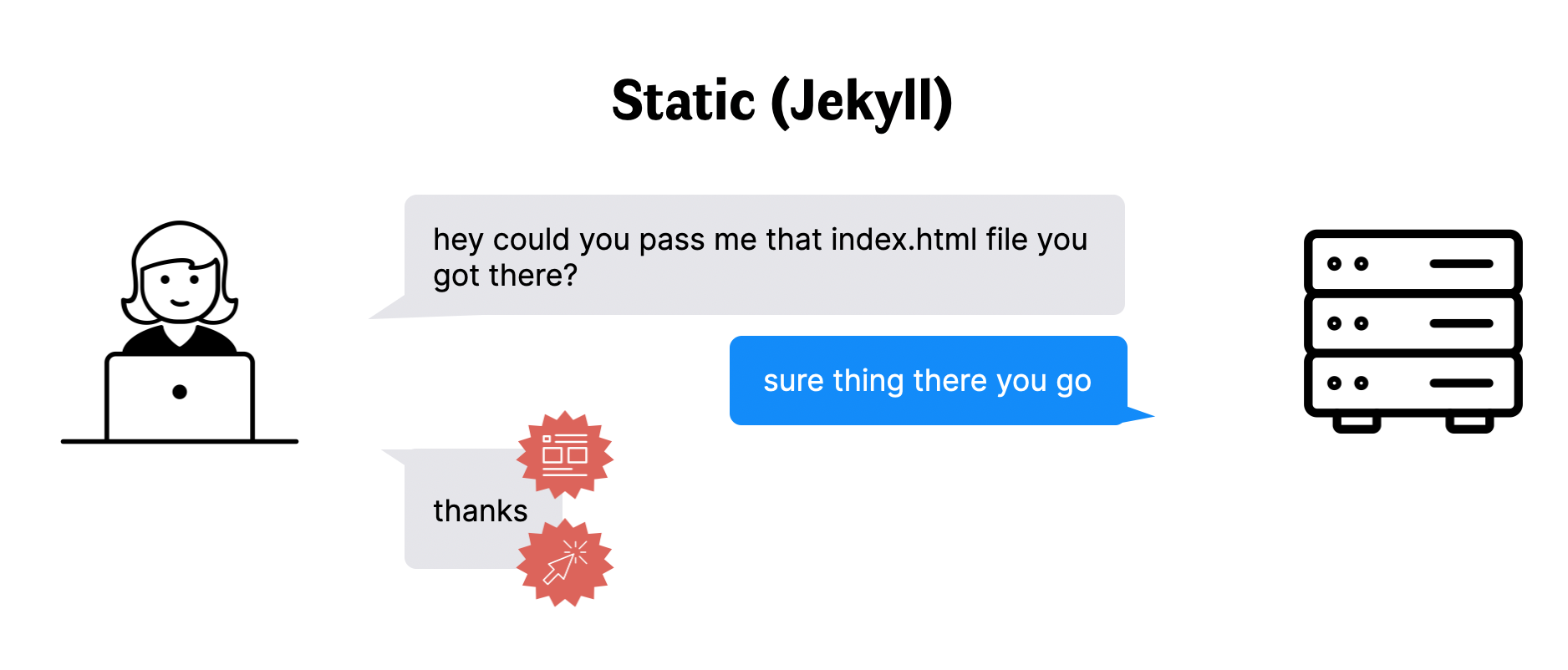
It’s straightforward. Simple. No shenanigans. The desired page is served immediately to the user, and it is immediately available to view and interact with. Should she navigate to another page, her browser would fetch it in the same way it did the first.
As years went by, however, the user experience this solution provided somehow lagged behind what users got used to with mobile applications. Transitions, offline-mode, all the bells and whistles of the mobile revolution were nowhere to be found.
JavaScript frameworks, Angular, React and Vue among them, offered a new proposition that was to bring native-like experiences to the web, bringing us to our next stop: Client-Side Rendered websites.
Client-Side Rendering (e.g. React, Vue)
To make websites feel native-like, the solution offered by new JavaScript frameworks circa 2015 was to embed a JS-based engine that would create and update the HTML markup and associated styles dynamically. The upfront price to download, parse, and execute that engine would supposedly be offset by faster subsequent navigation and a richer user experience.
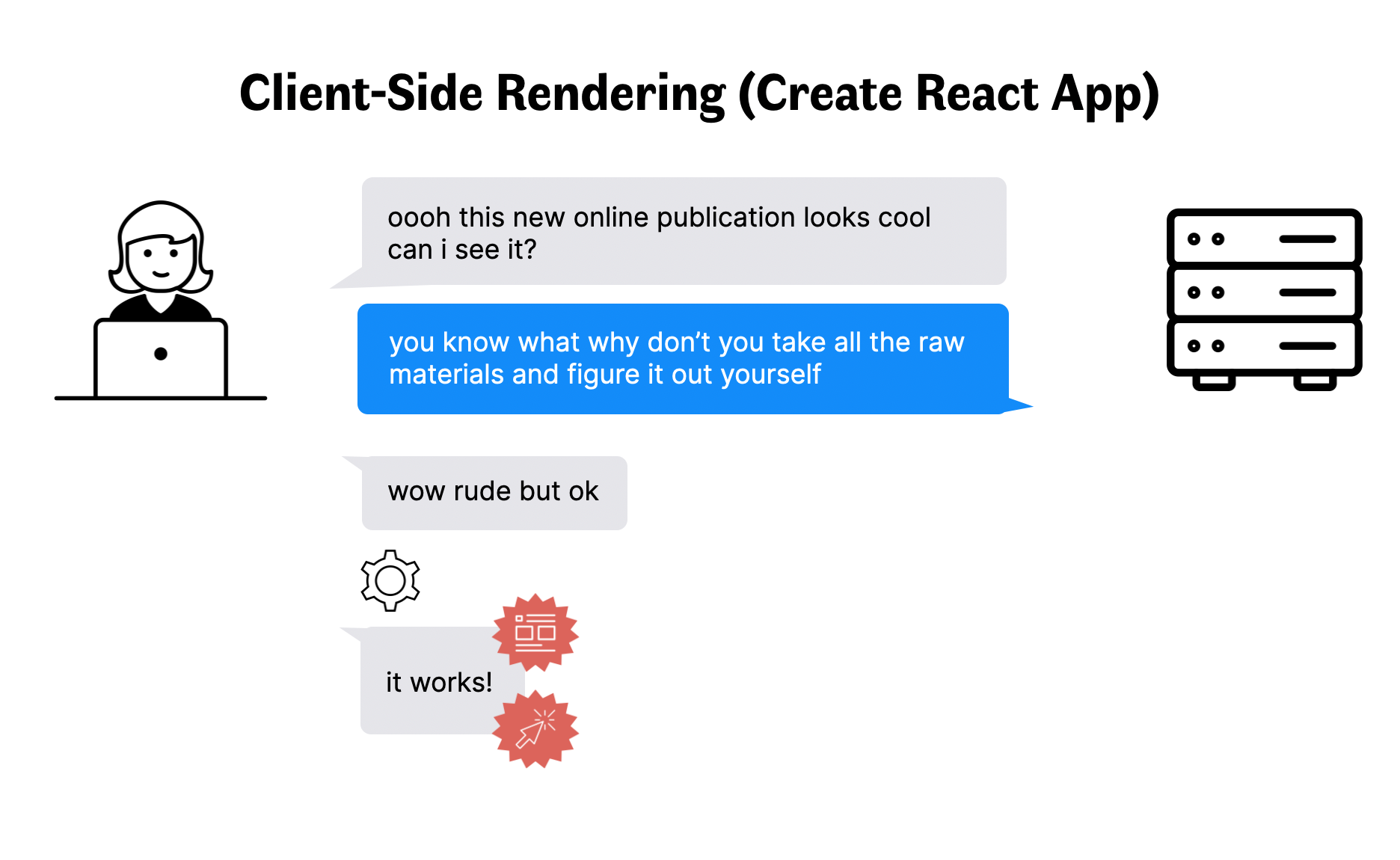
The major shift that happened with that evolution is that the cost of building web pages passed from the server to the user’s browser. This cost is indicated in the discussion with the gear icon, during which the screen is mostly blank or showing a loading indicator.
As a result, the performance of Client-Side Rendered websites depend widely on the specs of the device of the user, as JavaScript is CPU-intensive. The following video, by Josh Comeau, shows a 28 seconds difference (!) in load time for the Washington Post between an iPhone and a $100 Xiaomi Redmi 8.
Server-Side Rendering (e.g. Next.js, Nuxt.js)
A few years after this paradigm was introduced, these issues lead the pendulum to swing back towards the server, with the introduction of Server-Side Rendering.
Server-Side Rendering was introduced to fix one of the most annoying aspects of Client-Side Rendering: that the content the user came for would not be visible until after the (usually large) JavaScript code is downloaded, parsed, and executed. Those seconds can be the difference between the visitor staying or leaving the website.
Frameworks like Next.js and Nuxt.js appeared to try and bring the server back to its original role: building web pages. The approach would be different from Jekyll’s, though: in the Server-Side Rendering paradigm, the server acts as a web browser and renders the page using JavaScript—not Ruby.
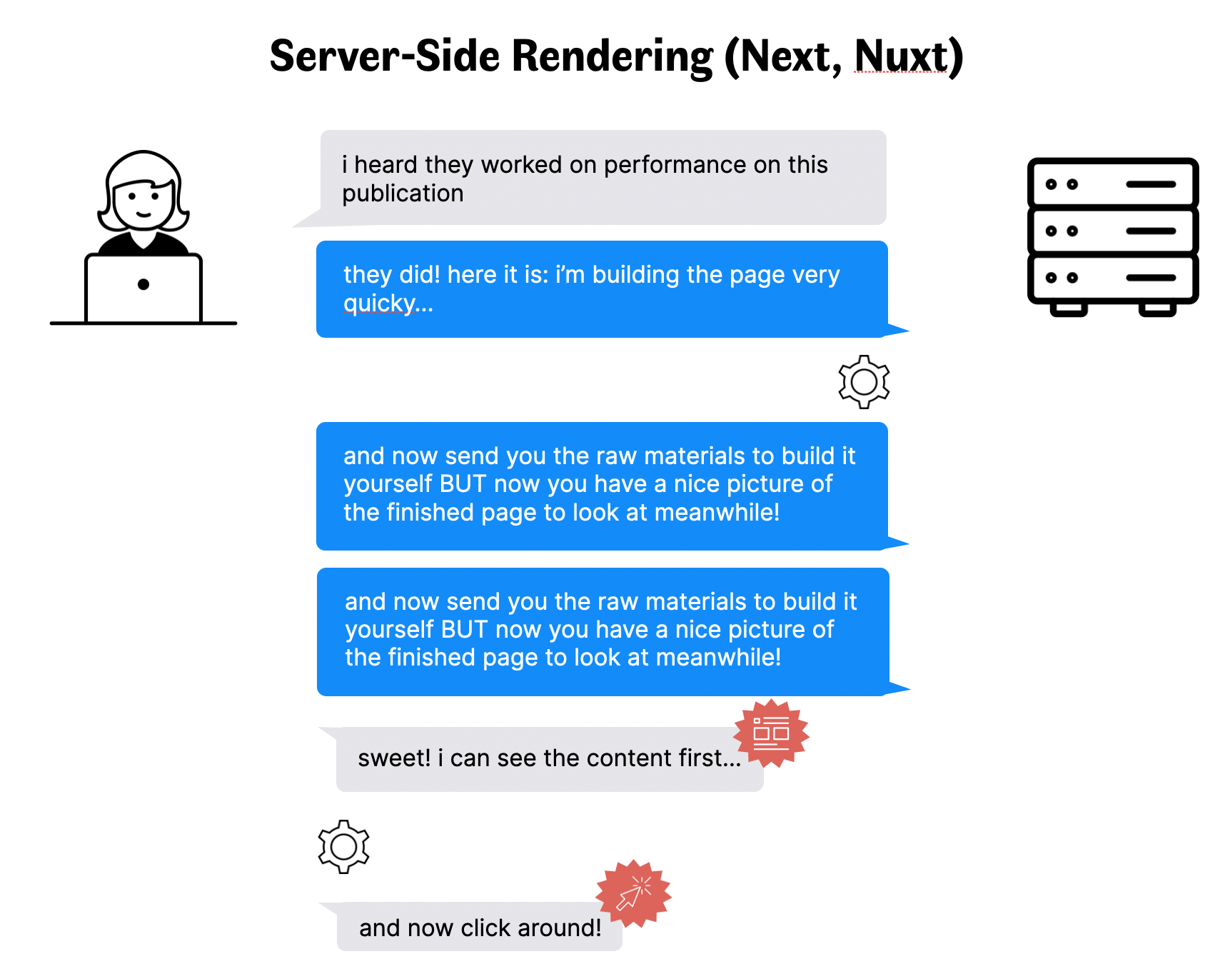
This approach leverages the power of the server to show the content to the visitor immediately. However, as interactivity still relies on client-side JavaScript, a delay is being introduced between the availability of the content and its readiness. From the point of view of the visitor, this can induce rage clicks: clicking on a button or a link has no effect for several seconds, as illustrated below.
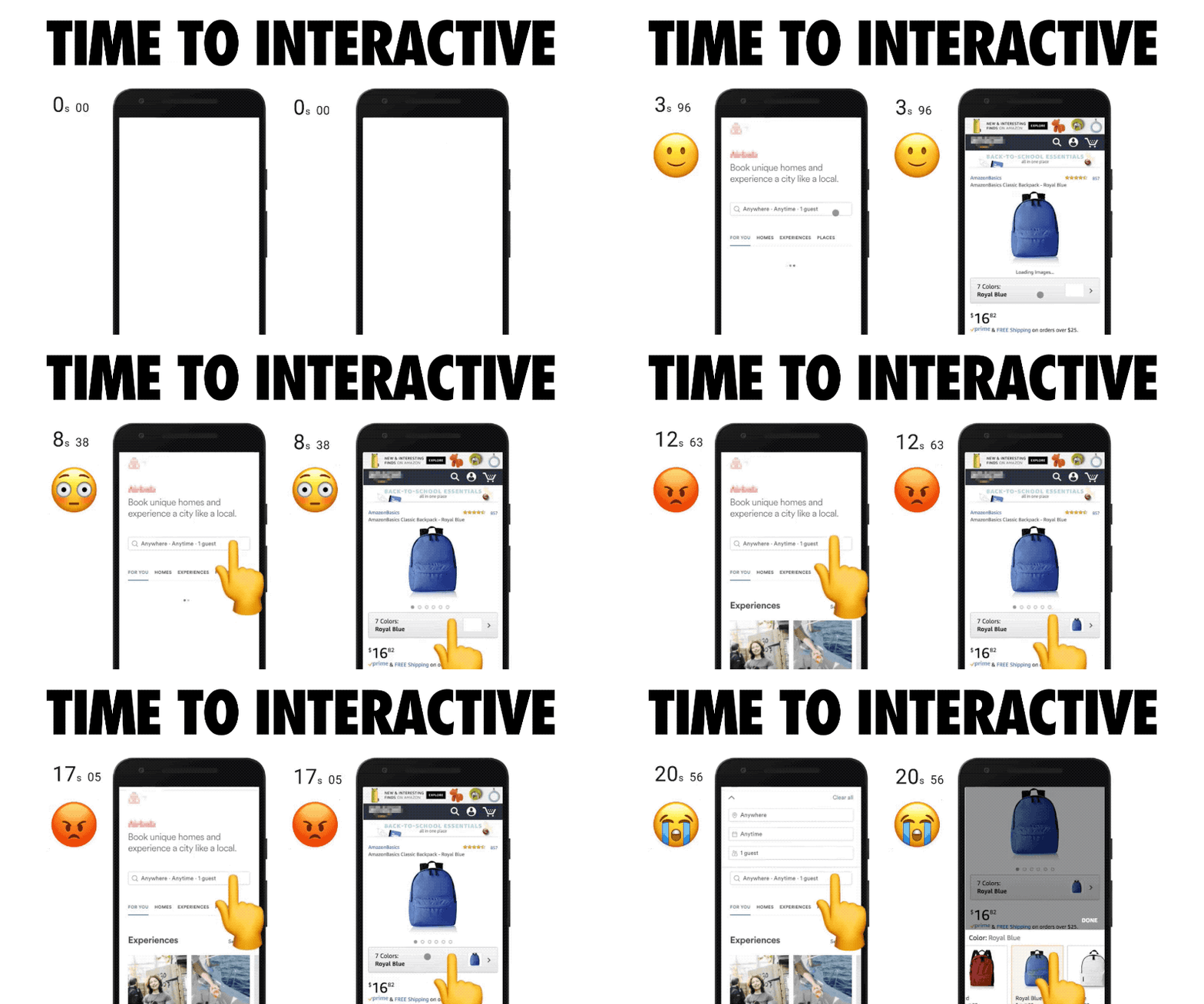
Source: Addy Osmany, The Cost Of JavaScript in 2018
There would be much more to say on the topic, as some of the frameworks have additional optimizations (prerendering, link-prefetching…), but we already covered enough ground to know that JavaScript has an impact on the user experience for Jamstack websites. This impact has been dubbed the JavaScript tax.
Curbing the JavaScript tax
Without entering into more details, we can follow the simple approximation that the less JavaScript is used, the lower the tax will be. Shipping less JavaScript then becomes a powerful approach to enhance the performance of our websites.
What if we could remove it altogether?
Next.js and Gatsby are two popular Server-Side Rendered JavaScript frameworks used on many Jamstack websites. They both use React as the underlying JS library to manage state and UI.
For this section, I’ll take my personal blog as an example. I chose to build it with Gatsby, as I wanted to learn more about how it worked and could leverage my React experience to ship it quickly.
The Developer Experience was a delight and I’m overall pretty happy with it, but something felt off. My blog is pretty basic: an index of all the articles, a page for each, and a few other pages here and there. Yet it was powered by the same technology that powers Facebook, AirBnB and many other extremely complex websites: React. Any overengineering questions put aside, I still required any reader to download, parse, and execute React for no benefits at all. There are no smart widgets or complex UI to justify React. Only text and images.
My (outstanding) developer experience had an impact on my reader’s user experience. There is no such thing as trickle-down UX.
Well, it turns out that there is a way to get the best of both worlds. If, like my blog, your Gatsby website does not require React (or any other JavaScript) to run, you can disable it. The Gatsby Plugin No Javascript community plugin will let you enjoy the DX of Gatsby without taking a toll on user experience. A similar (experimental) plugin also exists for Next.js.
Of course, not every website is as simple as my blog—that would be pretty boring. A lot of Gatsby and Next.js websites out there rely on React for their user experience: pretty animations, shopping carts, newsletter sign-ups, and the likes. Is there something we can do on those websites to make them lighter?
(P)react
When React is required for a website to run properly, we can’t just get rid of JavaScript. What we can do, however, is look for ways to reduce its footprint.
Preact is an alternative to React that has the same functionality, the same modern API, for a tenth of its size. The Preact team managed to drastically reduce the footprint by dropping support for some old browsers and legacy React APIs.
Although there are some slight differences (see the list), Preact can be used instead of React for many websites without any impact on the end-user, and barely any on the developers.
We switched from React to Preact on the Orbit app without issues and shaved off half of our JavaScript footprint in the process. If you’d like to try, there are plugins for Gatsby and Next.js, and a guide for switching manually.
Now, say you are in a situation where you have to create a brand new website. You want to use the Jamstack because you’re convinced of the benefits. You want to be mindful of the user experience, also because you’re convinced of the benefits. Say the website you want to create is similar to this very one, orbit.love.
What would you choose for a Lightweight Jamstack? What did I choose for a Lightweight Jamstack?
Building orbit.love with Tailwind, Eleventy, and Alpine.js
The Orbit website does not have a complex UI—interactivity is limited to a mobile nav menu, modals, and sign-ups for our newsletter and early access. I knew from the get-go that reaching out to (P)react would be heavy handed, so I looked for lightweight alternatives.
I went for the following: TailwindCSS, for styling, Eleventy, for the static site generation, and Alpine.js, for interactivity.
Eleventy is a JavaScript-based Static Site Generator that, despite being written in JavaScript, shares a lot more with Jekyll than with Gatsby. Indeed, Eleventy (also known as 11ty) does not ship any JavaScript by default. You are free to add any, of course, but it does not force you to use any library or framework.
Not having to use a JavaScript framework also meant that HTML, not JSX or Vue components, is now front and center in the code you write. This helped me avoid the usual traps when writing React: the infamous div soup, inaccessible components, or non-semantic tags.
TailwindCSS is a utility-first CSS framework, which means that instead of writing CSS for your components (class="navbar__mobile"), you combine utility classes that each do one specific thing (class="flex flex-row justify-center w-full").
I find this approach incredibly productive once you learn the grammar, and it makes for a resilient CSS architecture at the admitted cost of some duplication in your code. What makes it a great match with Eleventy is that you rarely, if ever, leave your HTML components when writing code. It helps me focus on the task at hand by avoiding context-switching.
Now, although my focus was on limiting the impact of JavaScript, it was still required to drive some components of the website: the mobile menu, modals and newsletter sign-ups.
Alpine.js seemed like a good compromise to full-blown JavaScript frameworks. Alpine’s premise is that it augments, rather than takes over, the HTML markup. Using a syntax inspired by Vue, it can be “sprinkled” on your markup at the places that need interactivity, leaving the rest intact. Compared to React (42kB minified and Gzipped), and Vue (29kB), Alpine only weighs 8kB, effectively curbing the JavaScript tax.
The Teastack, a lightweight Jamstack
If Jamstack (JavaScript–API–Markup stack) ushered in an era of breakfast-related acronyms, I would like to suggest a new one. The Teastack (Tailwind–Eleventy–Alpine stack) offers an amazing developer experience, promoting HTML markup back to its central place in developers' minds, while being mindful of user experience and web performance.
As Nicolas Hoizey wrote, Jamstack is fast only if you make it so. Going towards a lightweight Jamstack looks like a good step in that direction.
If you’re curious about real-world usage of the Teastack, this very website is open source. Feel free to have a look at the code, and to reach out on Twitter (@phacks) to start the conversation!
Originally published on the Orbit Blog.